Powerbeat Now
Now
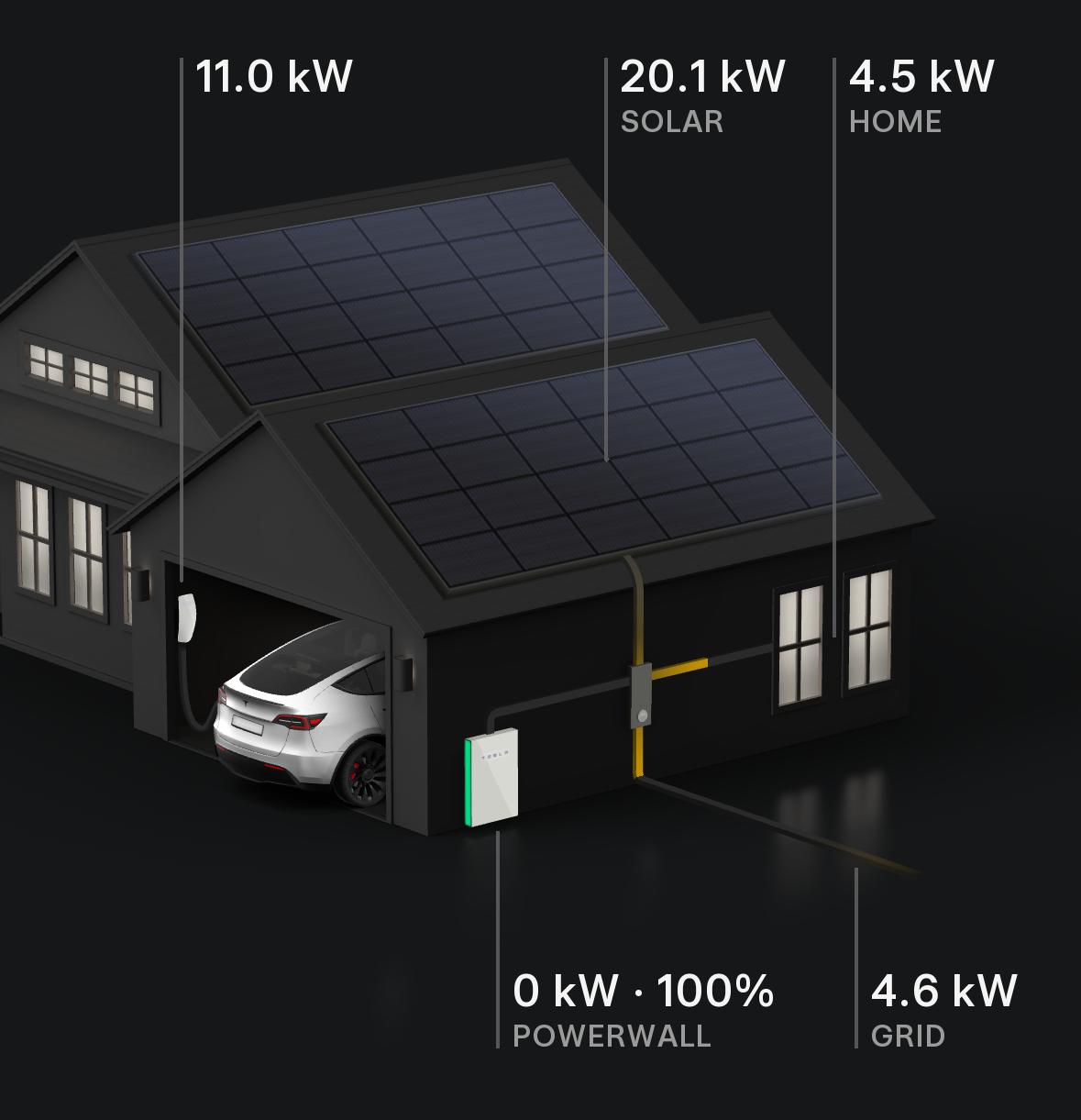
The first part of the UI will show the current status: how much kW power you get from your solar roof, how much kW your house consumes, and what’s the current kW power being exported to the grid. The Tesla App shows a nice house animation for a Powerwall installation:
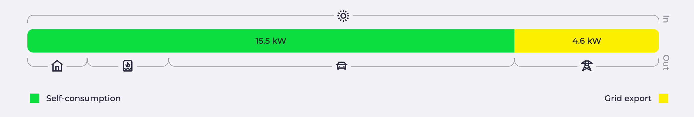
The visualization of EVcc is great as well, showing the proportions between the energy flows:
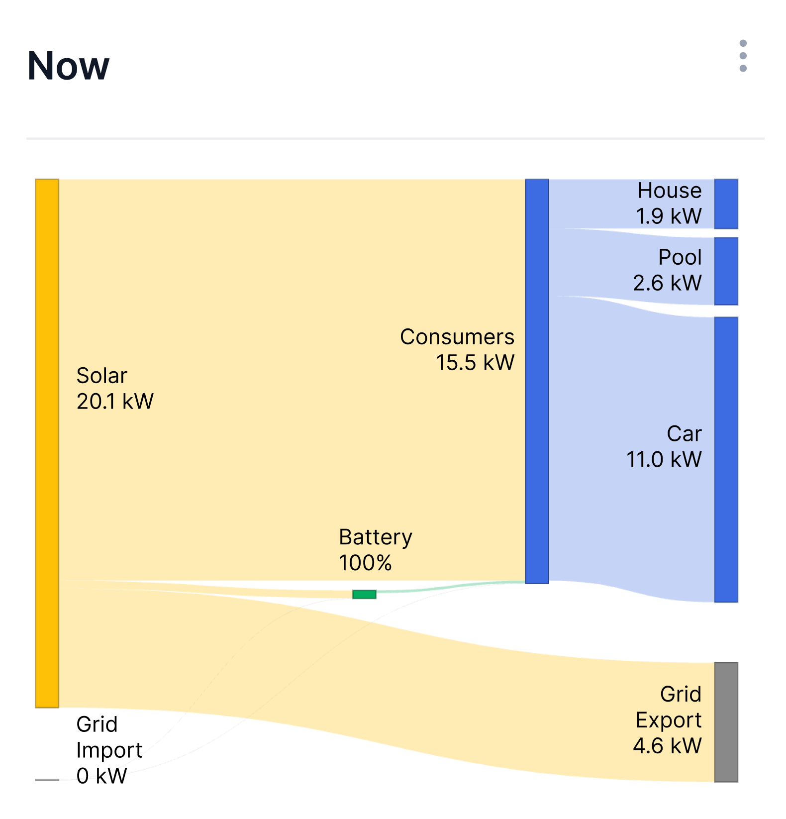
In my opinion a Sankey diagram makes much more sense. The diagram shows the data ratios and where devices like the home battery are in the right spot in the power flow:
House images like in the Tesla App are always nice. But if the app is showing the house, I want to see a small 3D model of my house. Hehe :-)